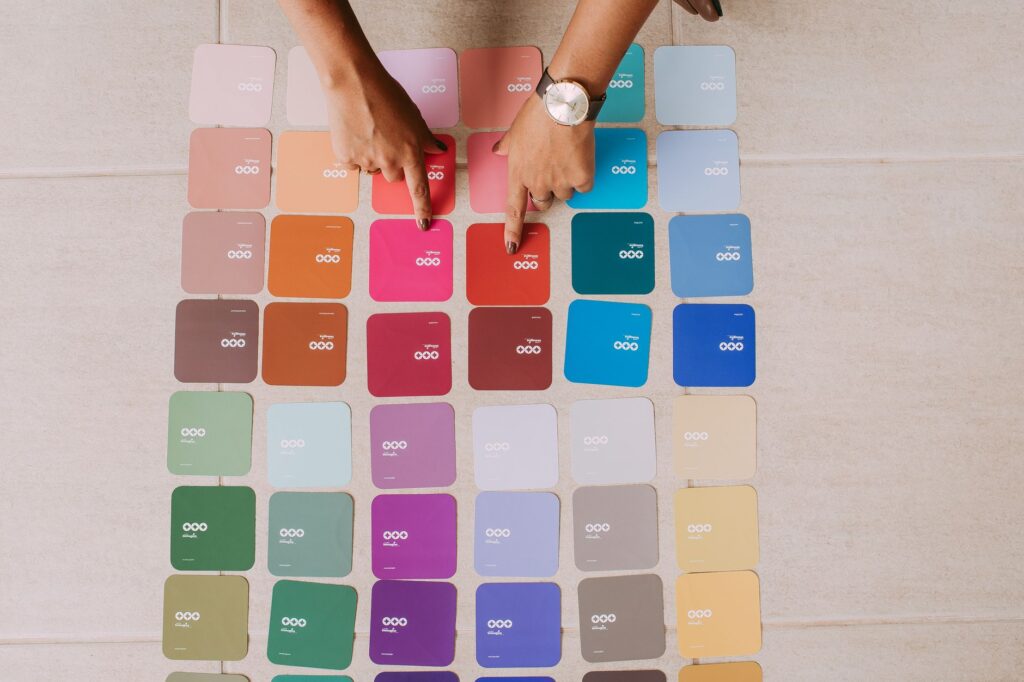
Color Pal Lite is a color palette generator that helps you create a 5 swatch palette. From one base color. So You can copy HEX values. And check WCAG contrast ratios against white and black.
It runs rihgt in your browser. Adn the page promises full privacy, your data never leaves your device.
Becuase of this, it’s perfect if you want a quick webiste palette. Without sending info outside your browser.
Teh proccess is simpel and clear.
You pick a starting color, select a harmony, then review the swatches. After that, you check which colors work behind white or black text. This tool wont certify your whole site as accessible, though.
Still, it removes much guesswork. Before you add colors to your CSS.
Check contrast and build your palette directly in the browser
Most palettes look good but struggle when used in actual interfaces. Like, a blue might complement orange well. But fail as a button color with white text. Color Pal Lite blends a harmony generator with a contrast checker. Thats the point.
You can judge looks and readability together. Makes sense.
The free version always shows exactly 5 swatches per harmony. Enough for a main color, accent, subtle support.
A couple of alternatives you might reject. Look, Each swatch is tested against white. Black text, with AA and AAA badges shown near the ratio.
This focused approach helps you get quick answers. For the most common uses. Foreground colors on white or black backgrounds, rather than claiming perfect results for.
Evry UI element like focus rings or icons.
Text size is also taken into account.
Start with a base color using HEX, RGB, or HSL
You can enter your Base color using the Color picker or type a value directly. Sample inputs in the tool include #3366FF, rgb, 51,102,255, or hsl, 225,100%,60%.
If you have a brand color. In RGB or HSL, there’s no need. To convert it before usign the tool.
Looking for a HEX color palette generator? The output remains easy to use since you can copy each swatch as a HEX value.
Tihs format is common for CSS, site builders, and quick handoffs.
Try the Random option if you want to explore colors. And don’t have a fixed brand color yet. I mean, But if you already have a logo or product color. Start with that.
Exploring randomly is fun.
It might pull you away from the colors your audience already connects with your project.
Pick the right harmony for your palette
The Harmony setting changes the palette’s mood more than adjusting the base color.
Color Pal Lite has five free options. Complementary, Analogous, Triadic, Split complementary and Monochromatic.
| Harmony | Best use | Watch out for |
|---|---|---|
| Complementary | Strong accent color beside a main brand color. | Can feel loud if both colors compete. |
| Analogous | Calm palettes with related hues. | Swatches might be too close for links, alerts, or buttons. |
| Triadic | More variety while keeping balance. | Needs clear roles or it feels cluttered. |
| Split complementary | Softer take on complementary pairs. | Accent colors can multiply fast. |
| Monochromatic | Single color branding, dashboards, and subtle interfaces. | Contrast between swatches may be low. |
When using complementary palettes, treat the second color as an accent. Rather then using it everywhere.
Analogous and Monochromatic palettes tend to be safer for quiet backgrounds. Often need strict contrast checking before you rely on them for text.
Copy HEX values and examine all 5 free swatches
The generated Palette displays five swatches in the free version.
Click a swatch to copy its HEX code or use Copy all HEX to grab the entire set. For CSS, notes, or site builders.
Remember, not all five colors serve the same purpose. Thing is, a good website palette assigns roles like background, main action, secondary action, border, and highlight.
If two swatches pass contrast only with black text, don’t use them as white text buttons just.
They look balanced in the row.
Check WCAG contrast ratios against white and black
Each swatch shows its WCAG contrast ratio with both white and black.
If your button label is white, look at the value against white.
I mean, For body text in black on a light background. Check the value against black.
Color Pal Lite acts as an accessible color palette tool in this way. It displays contrast ratios. Shows AA and AAA passes for white and black pairs. It doesn’t promise full website accessibility. And doesn’t cover every WCAG rule.
The best approach is to avoid pretty colors that fail their main job. If a brand color doesn’t work with white, try black text, select another. Swatch, or keep that color just for decoration where readable text isn’t needed.
Step by step: build and check a palette in Color Pal Lite
- Open Color Pal Lite in your browser.
- For Base color, use the Color picker or enter #3366FF, rgb, 51,102,255, or hsl, 225,100%,60%.
- Click Random to ahve the tool pick a random base color.
- Pick a Harmony like Complementary, Analogous, Triadic, Split complementary, or Monochromatic.
- Look over the generated Palette of swatches.
- Use Copy all HEX, or click a swatch to copy its HEX code.
- Check each swatch’s WCAG contrast ratio against white and black. Including AA and AAA pass marks.
- If you use Pro features, try Tetradic (Pro), Square (Pro), Shades and tints scale (Pro), Size, Color blind preview, Export, Contrast matrix, and History.
- Use Get Embed Code, then Copy Code. If you want to insert the embed code into a page.
The paid Color Pal Lite plan lets you size your palette from 3 to 12 swatches, lock swatches, access. Pro harmonies, export palettes, see a contrast matrix, preview colors for color blindness. And save history locally.
What Pro has for working on bigger palettes
The free version works well for quick checks. With five colors and contrast against white or black.
And But Pro helps if you compare larger systems, save palettes, or share colors with others clearly.
- Choose a palette size from 3 to 12 swatches.
- Lock individual swatches while generating new ones.
- Tetradic (Pro), Square (Pro), and Shades and tints scale (Pro) options.
- Export palettes as CSS variables, JSON, CSV, or PNG.
- See a pairwise Contrast matrix comparing all swatches to eachother.
- Preview how colors look for Normal, Protanopia, Deuteranopia, and Tritanopia vision.
- Store up to 50 palettes in localStorage with restore and delete options.
The contrast matrix is a big upgrade, it compares swatches with each other, not just white and black. The interface will say Scroll sideways to see all columns →. If the matrix is too wide for your screen.
Privacy, localStorage history, and embed options
Color Pal Lite runs entirely in yuor browser. Also, the page promises 100% privacy because your data never leaves your device.
Here’s important when you work on unfinished brand colors or explore client palettes.
You can also use it for quick prototypes you dont want saved outside your machine.
The Pro History feature saves your last 50 palettes using localStorage.
If storage isn’t available, the app will note Storage unavailable: history kept for this session only.. If you have no saved palettes, it shows No saved palettes yet..
The page also gives an embed code area with Paste this into any page:. And a Copy Code button. Use it when you want to place the palette tool inside a page you control.
Apply the palette on your website without overusing it
A palette can feel off. If every swatch is used equally loud.
Try starting with one main color and picking one action color.
Then use the ohter swatches to suport borders, backgrounds, or small highlights.
If your preparing site assets, keep image tasks separate. Use the Private Bulk Image Compressor for compressing images. And the Private Image Converter to switch formats once the colors are set.
Common mistakes and quick fixes
The base color won’t parse
Use one of the exact formats shown. #3366FF, rgb, 51,102,255, or hsl, 225,100%,60%. If you copied a color name or a diffrent format, convert it first to HEX, RGB, or HSL.
The palette looks great but the text fails
Try not to use that swatch. On areas wiht a lot of text.
Use it for decoration, borders, icons, or small details instead. Then pick a swatch with better contrast for text backgrounds.
The Monochromatic option feels too flat
Try Complementary, Triadic, or Split complementary if you want clearer visual roles. Monochromatic palettes look nice. But can make buttons and links blend too much into the UI.
You copied colors without checking white and black
Look again at your swatches. And check both contrast ratios before picking text colors. A swatch that works on black text mgiht fail on white.
The opposite happens too.
You expect Pro controls in the free tool
The free palette allways has 5 swatches and 5 harmony options. Features like palette sizes from 3 to 12, swatch locking, exports, a contrast matrix. Color blind preview. History are all Pro only.
Why is history missing or temporary?
History is a Pro feature and needs localStorage to work.
If storage isnt availible, the app only keeps history during the session. So save anything important before closing.
Frequently asked questions
What is a color palette generator?
It creates a group of colors starting. From one base color by applying harmony rules.
In Color Pal Lite, the free harmony options include Complementary, Analogous, Triadic, Split complementary and Monochromatic.
Can I enter RGB or HSL instead of HEX?
Yes. The Base color field accepts a color picker value or text like #3366FF, rgb, 51,102,255, or hsl, 225,100%,60%. You can also use Random. If you don’t have a starting color.
Does Color Pal Lite include a WCAG contrast checker?
It does. You see the WCAG contrast ratio of each swatch against white. Black, plus AA and AAA pass badges.
The Pro version adds pairwise contrast checks between all swatches in the palette.
Is Color Pal Lite an accessible color palette generator?
It helps you pick accessible colors. By showing contrast ratios against white and black.
But it doesnt guarantee full web accessibility or check all WCAG rules.
Does the free tool include color blind palette preview?
No. Color blind preview modes for Normal, Protanopia, Deuteranopia and Tritanopia are Pro features.
The free version still lets you create 5 swatch palettes and copy HEX values.
Can I export CSS variables, JSON, CSV, or PNG?
Those export options are Pro features. Honestly, In the free version. Use Copy all HEX or click single swatches to copy there HEX values.
Start with the real color you allready have. And choose one harmony. Always check contrast before naming your palette.
If numbers conflict with the look, trust the numbers for text. And save tricky colors for decoration.
Try It Free: Color Pal Lite
In-browser color palette generator and harmonizer with accessible contrasts.
Open Color Pal Lite →